I've been working with a client for about a year and a half now, and their job is finally coming to an end. I've been lucky on this project, you see my client has great taste. I was mainly involved with the millwork design (all custom cabinetry, paneling, post details) throughout the project, though we did get into ceiling design, and consultations for tile and colours. Normally, that gives me a bit of a scare, but I think you'll see from the pictures that I had very little to be worried about.
Now, the project isn't complete yet, so forgive the slightly unfinished look to the pictures. The final touches have yet to come, but its so close, I thought I would share a few (well, quite a few), of the almost finished images with you.
I really love this guest bath. Its a great size for a guest bath, and with future plans as an in-law, it should be. Gorgeous marble flooring goes off so incredibly well with this charcoal grey (Benjamin Moore - Iron Mountain) vanity. And look at those polished foot caps!
The built-ins in the dining room turned out incredibly well. The X's worked beautifully in proportion with the sizes of the doors. Each door on the built ins has it's own hardware, though the top two are pinned to the middle two on each piece. The bottom will open by itself, this way any mess can be tucked away and not opened if a wine glass is needed.
The walnut piece in the center has burl panels, it looks so rich next to the white of the built ins. I find it helps to frame and anchor the space, all it needs is a great piece of art to complete it!
Next up is this great little powder room vanity. Subtle patterned wall paper, very subtle vanity. The wall is paneled behind the unit. The mirror "sits" in the center panel, and flows through the vanity. The reflection of the light goes a long way to keep this space bright and light. Polished exposed plumbing, legs that give an airiness, and classic calacatta marble.
This is the amazing kids closet. There are two of these, matching, on opposite sides of the wall. What you can just see a hint of in the picture, are the two cabinets that create an entry way into the closet. Both are closed cabinets, but one has angled adjustable shoe shelves for the girls collection of footwear. Ample hanging space, double rods and two smaller sections of single rods for dresses and jackets.
The laundry is the one punch of colour on cabinetry in the house. The colour is Benjamin Moore Wedgewood Gray. Its from the historic collection, so you know it isn't crazy bright. But the colour is deep and vibrant and works very well with the creaminess of the Caesarstone Buttermilk countertops.
Master Baths should be relaxing and welcoming. The grey/white combo used in this room is is consistent with the rest of the house, but still has a warmth to it that you want in this space. The polished nickel (on everything!) is so nice and it gives you these little hints of brightness and pops of light all over the space.
When it came to the Master Closet, we had a large closet space to work with. But it was essentially a rectangle without much architectural interest and we needed to inject some life into it. The solution? Create two spaces, a dressing room and a closet. We separated them with a tall mirrored cabinet and created storage at the end of dressing room for finishing touches like shoes and bags.
One of the bonus' to separating the room this way is that the mess stays in the back of the room, and if the door is left open, you only see well finished millwork.
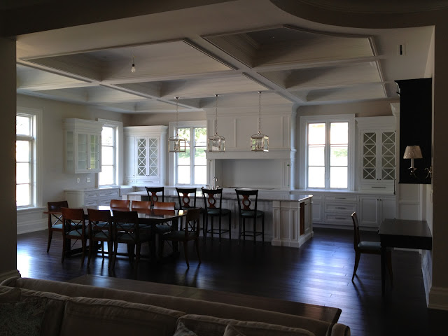
Lastly and just a quick (and dark!?!?) shot of the kitchen. The X Pattern is carried over from the dining room as well as the built-in feel. This kitchen is very much custom furniture built into the home. The 13' 6" island gives ample room for prep, and there is a generous 48" cooktop back there for getting down to business.
When we're finished, I'll grab some more (and some detailed) shots to show you!
I would love to hear your thoughts, how would this style work for your space?
Bill
............................................................................................................................................................


No comments:
Post a Comment